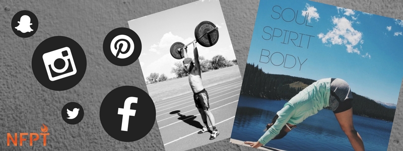
Follow these guidelines to attract new personal training clients with your social media photos and graphics. Start with good photos, create a uniform look and design with purpose.
As an amateur graphic designer and photographer, I have frequently pondered how to create content that would help me produce photos and designs that best represent the mission, vision, and personality of the person or organization I am creating content for.
Take Good Photos
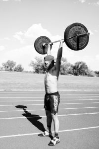
Since it’s not always practical, timely, or affordable to hire professional photographers to produce photos, I choose to take quality photos of my own. I generally use a digital camera for my photography, but when I don’t have my camera to capture a good photo, I can always use my iPhone instead.
Once I’ve got a good camera, I set off to capture photos of things that I know myself or my audience would want to see. I make sure that the photos I post are never blurry or unfocused photo and that they are something that will cause my audience to pause while they’re mindlessly scrolling through their feed.
When I’m viewing social media in the fitness arena, I often pause to see photos of people being active and promoting activity, and so that’s what I like to photograph. On the other hand, I don’t like seeing recycled stock photos from Google Images because I like to see what makes each trainer, athlete, or coach unique from everyone else.
Quick Tip:
Keep your social media original and take some time to build a library of photos that represent who you train, how you train, your mission as a trainer, and your personality. As you build your photo library, think about your target market and what they want to see when they’re scrolling through your Facebook, Instagram, or Pinterest page.
Create a Uniform Look
Having high-quality photos is important in attracting the right target market, but it’s also important to have a uniform and recognizable look to photos. A few things that that are important to focus on in creating uniformity are angles, backgrounds, and presets or filters.
Whatever subject I am primarily interested in posting photos of, I photograph from similar angles, or with similar backgrounds in order to create a collection of familiar photos for my viewers. Once I’ve captured the image, I use similar presets/filters to tie all of those different photos together.
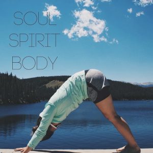
When picking my presets, I think about what feeling I’d like to convey to the viewer. If I’m posting something for a yoga instructor, I may use brighter and more blue presets as a finishing touch to my photos to convey a relaxing and calming feeling. If I’m posting something for a trainer who is intense and energetic I may use a higher contrast in some photos and perhaps a black and white preset in especially intense photos.
Quick Tip:
Apps like Snapseed and VSCO Camera are great for helping you to start creating high quality, attractive, and original photos for your social media platforms. Instagram and Facebook offer several presets/filters as well, but the other apps off more customizable tools to give your photos a unique look.
Design With Purpose
Great photos don’t always convey the exact message that I want to get across, and that’s where graphic design comes in. For posts that require some text, I use programs like Canva (www.canva.com) to incorporate attractive and uniform graphic designs.
Canva walks the user through very basic graphic designs and is very easy to use for amateur photographers in comparison to programs like Photoshop. Once I start the design, a few rules that I follow are to use a palette of colors that match the brand, feeling, or message that I want to convey, use similar fonts in each post, limit my fonts to two or three, and balance the text or design with the rule of thirds.
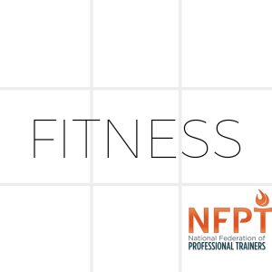
To keep things uniform, the text or design colors should match your brand, your presets/filters, and your personality. In order to keep designs from looking chaotic, limiting the number of different fonts will do just that.
The rule of thirds is an artistic concept that suggests that images should be imaginarily divided into nine equal parts with two equally spaced vertical lines and two equally spaced horizontal lines and that important elements should be placed in these sections.
Quick Tip:
Once you’ve built a library of photos for your social media platforms, upload them into a graphic design program like Canva and start designing or uploading your logo, inspiring quotes, and/or important announcements.
Following these procedures can make it quick and easy for you to create a consistent and uniform look for the variety of content that you produce as a fitness professional. Creating photos and graphic designs for your social media platforms does not have to be difficult or expensive. Start by making lists of what messages you want to convey, what colors you want to use, what subjects you want to photograph, and what you want your brand to say about you.
Hanna Riley B.S. in Kinesiology, NFPT CPT is a passionate trainer, writer, and graphic designer. Hanna's greatest passion is working with people who want to better themselves physically, mentally, and spiritually. She believes that we are all stronger than we think and she aspires to extend patience, kindness, education, self-motivation, confidence to her clients to help them unleash their strength. For more from Hanna, connect on social media on Facebook as Hanna Riley and Instagram as @house.ofhanna.

